
Building a Rising Food Delivery Brand
In the crowded space of food delivery apps, where convenience often trumps connection, WoodSpoon emerged with a revolutionary idea: what if you could have your grandmother's cooking delivered to your door? Not just any home-cooked meal, but authentic dishes prepared by passionate chefs sharing their cultural heritage, family recipes, and personal stories through food. This wasn't just another delivery service – this was about bringing the warmth and authenticity of home cooking to the on-demand economy.
The challenge lay in creating a brand that could capture this unique intersection of technology and tradition, of scale and intimacy. Working with WoodSpoon from its early stages, we had the opportunity to shape how this vision would come to life across every touchpoint – from the first impression a potential customer has of the brand to the moment they meet their neighborhood chef through the app.

Understanding the Problem
In a world where food delivery has become commoditized, WoodSpoon dared to be different. The platform wasn't just another delivery service – it was a marketplace where passionate home chefs could share their cultural heritage through food, creating connections that went beyond the typical transaction-based relationship of food delivery apps. Each order represented not just a meal, but a story, a tradition, and a piece of someone's cultural identity shared through the universal language of food.
As lead designer, I was tasked with creating and evolving a brand identity that could establish trust, drive growth, and eventually scale into corporate markets. The challenge was complex: how do you build trust in home-cooked food delivery while standing out in a market dominated by restaurant aggregators? How do you create a brand that feels both personal enough for individual diners and professional enough for corporate catering?
Our key challenges included:
Building consumer trust in home-cooked food delivery
Creating visibility in a crowded market dominated by restaurant delivery
Attracting and onboarding home chefs
Establishing a brand that could scale from consumer to corporate markets
Research Methodology
Our Research Revealed
Through extensive user interviews and market analysis, we uncovered a fascinating insight: people weren't just looking for convenience in food delivery – they were seeking connection. The stories behind the food, the cultural traditions, and the personal touch of a home chef resonated deeply with our target audience.
Critical Insights:
Authenticity wasn't just a buzzword – it was crucial for both chefs and customers
Personal stories and cultural connections created memorable emotional bonds
Visual consistency would be essential for building trust in a novel concept
The brand needed flexibility to speak to both individual consumers and corporate clients

%20-%20Copy.png)
%20-%20Copy.png)
.png)
Key Insights
Phase 1: Establishing the Foundation
Our initial brand identity was like setting up the kitchen – we needed the right tools and ingredients before we could start cooking. We created a distinctive wordmark incorporating a stylized spoon motif, symbolizing the personal touch of home cooking. The clean, modern aesthetic using flat illustrations helped establish trust in what was, for many, a novel concept.
We chose teal as our primary brand color – a deliberate departure from the reds and oranges dominating the food delivery space. This wasn't just another delivery app; this was something fresh and different.
Until April 2022
Phase 2: Authenticity & Storytelling
Once we had our foundation, we shifted focus to what makes WoodSpoon truly special – its chefs. We moved from illustrations to real stories, creating documentary-style content that showcased the passionate people behind the food. Our "Taste of Home" campaign featuring actual WoodSpoon chefs wasn't just advertising; it was a celebration of cultural heritage and personal narratives.
We developed location-specific messaging that played on the idea of bringing distant flavors close to home: "It's like dinner in Shanghai, without the 15-hour flight" became more than just a tagline – it was a promise of authentic experiences delivered to your door.
Until August 2022
Phase 3: Corporate Integration
As WoodSpoon grew, so did our opportunities. The challenge became maintaining our authentic, personal feel while speaking credibly to corporate clients.
We created a hybrid visual language that merged our warm, personal style with the professionalism expected in B2B communications. Like a chef adapting a family recipe for a large-scale catering event, we maintained the essence while scaling the presentation.
Starting September 2022
Visual Identity System

Our identity system was designed to be as flexible as a well-equipped kitchen – ready to serve any need while maintaining consistent quality:

Implementation & Results
The true test of any brand system is how it performs in the real world. We rolled out our identity across every touchpoint where WoodSpoon connected with its audience:
Digital advertising campaigns that told chef stories
Social media content celebrating food and culture
Chef onboarding materials that built community
Corporate presentation decks that maintained warmth while projecting professionalism
App interface elements that made ordering personal
Out-of-home advertising that brought local chefs to the spotlight
Video content that went beyond food to share cultural stories
The results spoke volumes about the power of authentic brand storytelling. We successfully launched the platform, attracted talented chefs, and built strong brand recognition in our target markets. When the time came to expand into B2B markets, our brand was robust enough to grow while maintaining its personal touch.
Illustration Style
Our illustration style evolved like our business – from simple, iconic designs that established the brand, to sophisticated compositions that could explain complex services to corporate clients. We maintained a consistent character design system that brought warmth to even our most professional communications.
Photography Style
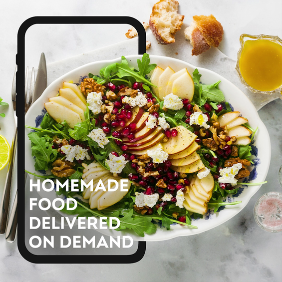
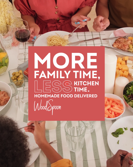
We embraced a documentary approach that celebrated authenticity. Food was styled minimally, letting its natural beauty shine. Chef portraits captured genuine moments in real kitchens, telling stories of passion and expertise without saying a word.
Color Palette
Our distinctive teal (#00A6AA) became our signature – as recognizable as a chef's special sauce. We supported it with neutrals for versatility and warm accents that made food photography pop off the screen.
Typography
The system balanced personality with professionalism, using our custom wordmark as the focal point, supported by clean, modern sans-serifs that could speak equally well to home diners and corporate clients.
Lessons & Insights
Building WoodSpoon's brand taught us valuable lessons about the intersection of digital platforms and human connection:
Authenticity isn't just a marketing strategy – it's the foundation of trust
Visual systems need to be as adaptable as the businesses they serve
Personal stories create stronger connections than any polished advertisement
Brand evolution should be intentional but not artificial
Process & Contribution
As lead designer, my role was akin to a chef orchestrating a complex meal – ensuring all elements worked in harmony while maintaining consistent quality. I:
Developed the comprehensive brand system from initial concept to full implementation
Created guidelines that allowed the brand to scale without losing its soul
Directed photography and video shoots that captured authentic moments
Managed the brand's evolution through business pivots
Maintained brand consistency across an expanding range of channels
Led the successful transition into B2B markets


